So, I present TDW's poll of the 3 ugliest courts ever assembled in Women's Final Four history.
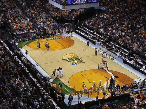
3) From last year's Final Four in Indianapolis, I give you THERMOCOURT...

Honestly, this is one of the more conservative courts of the past few years, but the inside paint designs are simply ridiculous. The courts normally attempt to wrap up a city's essence through its design each year, which must mean Indianapolis has an affinity for thermometers and/or old fashioned light poles. The fact that the designers don't give any other clues as to what these pictures may represent for the city of Indianapolis just makes this court absurd looking.
2) As the antithesis to Indianapolis' ambiguous and rather conservative court, I give to you this gem from the St. Louis Final Four

Seriously, if you're going to put an arch on the court, at least make it stay on the court and not trail off into the sidelines. At least make it blend in with the court by using less contrasting colors than solid blue, much like Denver has done with its mountains for this year's Final Four. If the majority of people didn't already know that there is a huge Arch located in St. Louis, I'd venture to say that most people watching these games understood afterwards. And that's somewhat of a positive, I guess.
1) As bad as the other two courts were, nothing tops Tampa Bay's quest of transforming a court into a visual culinary masterpiece
Yes, the great state of Florida, sometimes referred to as the "Orange State", decided to turn its court into a fruit. Now, let me start by saying that this court does a pretty good job at incorporating designs into the court without making it contrast significantly with the rest of the hardwood (unlike St. Louis). But the thought of someone attempting to transform a court into an orange is just too much for me to comprehend.
I will give credit that Tampa has a unique vision going into its design process, unlike Indianapolis. But with the wide range of attractions found in the state, I feel there could have been at least one other design that would highlight a more significant state symbol.
I present my idea of Tampa's court below, by way of Paint:

You're welcome, Tampa.
No comments:
Post a Comment